We want to use colour not just as a tool for making things look pretty, but also as a way of guiding people through the things we make. Through colour we seek to establish hierarchy, and set dominant elements in what we design.

Procurify is all about that sweet sweet green, or as we like to call it: Aurora (#03BA5B). It's used throughout the company as our dominant colour, including the logo.
Aurora is typically complimented by another we call Soul Flare (#FAAB18). Though Aurora is our dominant colour, Soul Flare acts as an accent used to highlight elements including buttons or other calls-to-action. And yeah, it’s the flame in our logo.
The rest of the Procurify spectrum however doesn’t fall too far behind, with a nice little rainbow for you to play with. With Aurora and Soul Flare leading the charge, the other colours exist to support and provide vibrancy to the Procurify palette.
Additional Guidelines

Use the color to draw attention
To maximize Aurora, Flux and Soul Flare, using color in elements such as title text is encouraged to differentiate. However body text must always be either eclipse or white.
Example: Flux title next to eclipse body text
Focus on the primary colors
Aurora, Flux and Soul Flare.
These are the major 🔑s to Procurify's visual identity. Though we have a plethora of vibrant choices, try to use Turbo, Nebula and Nova selectively.
Example 1: Primary colors representing different sections in a diagram.
Example 2: Using Aurora background color as a visual anchor of the design

Find the right partner
Certain colors go best with others.
Example: Pairing Soul Flare and Abyss buttons next to each other will create a sense of contrast.

Any interactive element needs to be differentiated by color
Main Calls-to-action or any element associated to creation need to be Soul Flare orange whilst secondary links or in-text links should be Flux blue.
Example: 'Request a demo' and 'Try Procurify' buttons in Soul Flare orange.

If you're using a primary color as a background, pair it with white text
Use contrast to your advantage to ease readability. Cause yellow text over a white background is a bad time.
Example: Presentation slide with a Soul Flare background and white text


Comprised of an Aurora Green P and a Soul Flare orange flame, our logo is a rocket, hence the theme of space throughout the company. The logo either stands on it's own or is paired with the Procurify wordmark.

The right logo for the right occasion
So when using the logo, there are a few guidelines to follow to ensure consistency with our brand identity:
Here are four examples of what the logo should look like:
Colored glyph on white background
Black on white background
White glyph on black background
White glyph on colored background

Colored horizontal logo on white background

Black horizontal logo on white background

White horizontal logo on black background

White horizontal logo on colored background

Color stacked logo on white background

Black stacked logo on white background
White stacked logo on black background

White stacked logo on colored background

Colored Wordmark on white background

Black (yes, there's a slight difference) on white background

White wordmark on black background

White wordmark on colored background
Though we encourage you to use the full color logo as much as possible, it won’t show up too well on a dark background, so maybe it would be best to use a white version there instead. Use your own discretion to decide which logo would look best in a situation.
Let the logo breathe
All the elements in our logo have been adjusted for optimal breathing room. Let the design flow do it’s thing and keep the space consistent. A good rule of thumb is to space all the elements with the 'o' in the 'Procurify' wordmark.

The logo is like a gun. Powerful, but don't misuse it.

Rocket goes on the left, wordmark on the right.

Don't rotate the rocket

Don't rotate the logo

Don't change the color of the rocket. The correct color combinations are above

Don't change the color of the wordmark. The correct color combinations are above

Don't apply any extra effects e.g. gradients, drop-shadows, embossing, etc.

Don't mess with the typeface or the alter the rocket logoform in any way
Our primary font is a typeface by the name of Overpass, a Google font with a diverse set of different font weights.
Characters
ABCĆČDĐEFGHIJKLMNOPQRSŠTUVWXYZŽabcčćdđefghijklmnopqrsštuvwxyzž1234567890‘?’“!”(%)[#]{@}/&\<-+÷×=>®©$€£¥¢:;,.*</-+÷×=>
Download OverpassOr get Overpass from Google Fonts here
Throughout Procurify, we want to limit the use of different weights to ensure a consistent typeface across the organization. The two weights we mainly use are Regular and Bold, typically reserved for titles and body text. Italics are also good for quotes.
A key thing to consider is to differentiate text with at most 2 factors. For example differentiating a subtitle in a presentation with color and font weight.
Despite the fact that we use Open Sans in our actual Procurify App, it's important that all our customer-facing touchpoints and materials use Overpass.
Subtitle Example - Flux Overpass Bold
Quote Example - Abyss or Eclipse Overpass Italic
Subheading - Flux Overpass Bold
Body Text - Abyss or Eclipse Overpass Regular
Link Text - Flux Overpass Regular
Body Text Example:
Niche market buzz churn rate low hanging fruit hackathon. Incubator twitter research & development series A financing.
Funding incubator crowdsource gen-z OH HEY AN IN TEXT LINK iteration metrics marketing monetization ecosystem early adopters strategy venture. Android strategy success influencer creative technology non-disclosure agreement.
Examples
Business Card:
-Quote in flux, larger, Bold
-Name in Bold
-Details in Regular

Presentation Slide with Colored Background:
-Title in white, larger, Bold
-Text in white, Regular
Website Section:
-Section Title in flux, larger, Bold
-Body text in Abyss, Regular
-Box subtitle in Abyss, larger, Bold
-Box body text in Abyss, Regular
-Box Link text in Flux Regular

Download the Procurify Iconset
We have a majestic collection of icons that we use in the app and by extension in our other materials. Some of these icons are universal but in order to use the icons with reference to Procurify, make sure you understand what it refers to.
For instance a shopping cart in our app refers to the Purchase tab, however an outsider could interpret it as a checkout option of an online store, or maybe an indication of where the grocery aisle is. It's up to you to apply the right wording and context to an icon. Especially if you're explaining something Procurify related to a stranger.
The iconset is available for download as an SVG format for editing and PNG for presentation or document usage.
App Icons

Logo

Globe

Request

Purchase

Receive

Accounts Payable

Archive

Settings

Manage

Attach

Edit

Add

Meals

Expense

Save

Credit Card

Vacation

Flight

Upload

Download

Timer

Switch

Sort Descending

Sort Ascending

Filter

Reset

Search

Report

Record


Question

Other

Notification

Order

Mileage

Message

More Options

Lodge

Lock

Unlock

Link

Location

Labour

Inventory

Image Gallery

Import

Export

History

Folder

Error

Favourite
Empty State
Empty Cart


Edit Log

Duplicate

Approve

Disapprove

Disabled

Remove

Check Mark

Close
Up Arrow
Down Arrow
Left Arrow
Right Arrow

Catalog

Camera

Both Arrows

Audit Log Arrow

Attention
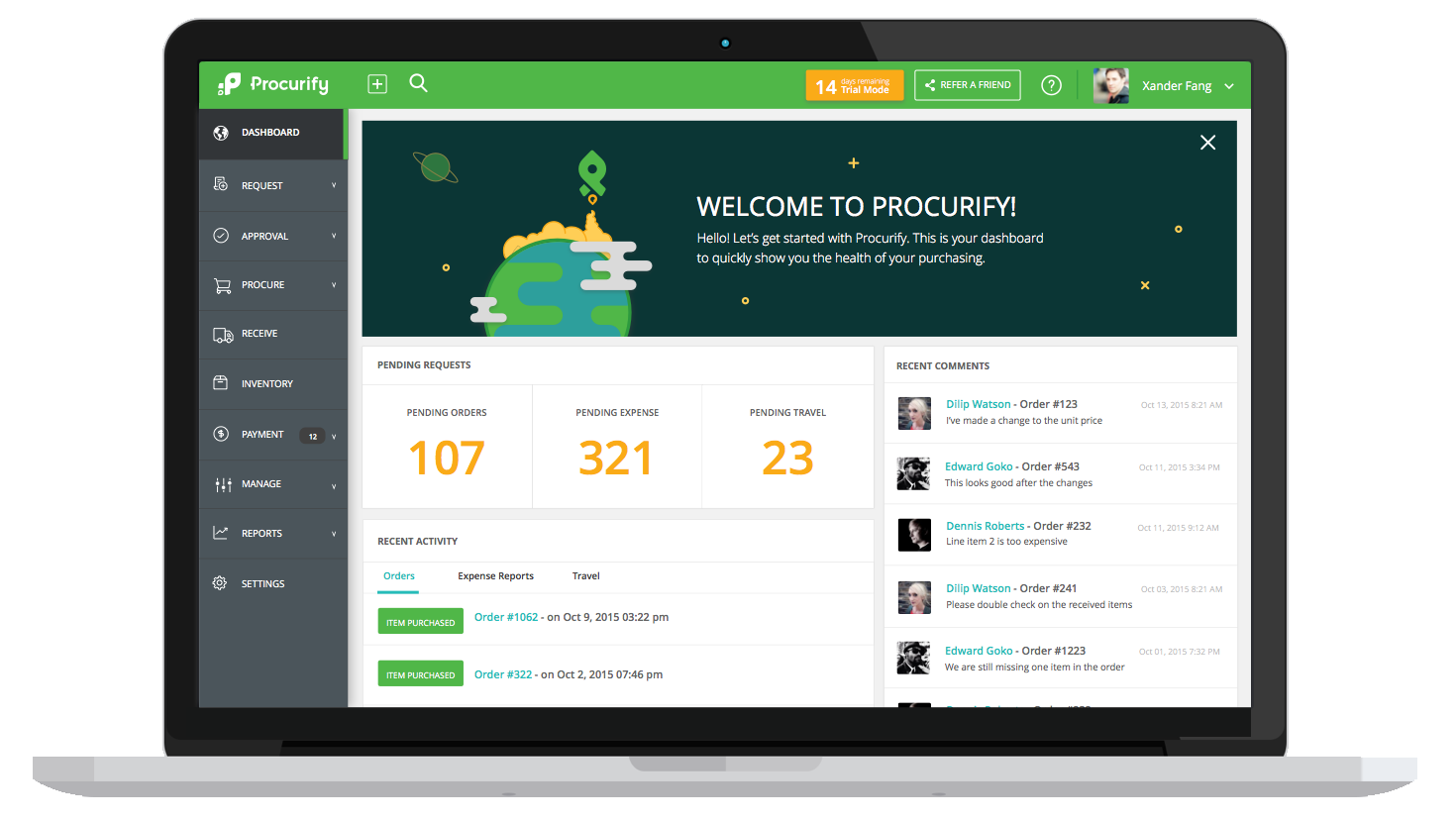
Web App Screenshots

Request Screen

Receive

Purchase Orders

Budget Control

Order Approvals

Adding Unbilled Item
Web App Mockups

Laptop
Laptop 2

Laptop and Phone
Laptop and Phone Dark
Dashboard in Laptop
Mobile App Graphics

Budgets - iPhone X

iPhone X in hand

Phones
Interface Elements

Account Code Budgets
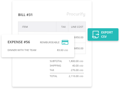
Bill + Expense

Chatbox

Order Status

Budgets

Integrations
Illustrations

Transparent Pattern Background

Aurora Pattern Background

Soul Flare Pattern Background

Flux Pattern Background
Illustrations
Transparent Pattern Background
Aurora Pattern Background
Soul Flare Pattern Background
Flux Pattern Background
At Procurify, we have many different ways we communicate with our clients. From emails, to phone calls, to marketing materials - there are many different types of messages we’re looking to convey. With such a wide range of communication to cover coming from different people, how do we make sure we sound like we’re all on the same page, and properly representing Procurify’s image?
This is where Voice and Tone comes in. With a defined set of guidelines, we can ensure that we all have the tools we need to make sure we’re (literally) all on the same page. This page.
But before we can discuss Procurify’s Voice and Tone, we first need to understand the difference between Voice and Tone.
What is Voice & Tone?
Voice
Our voice is what we say - it’s the message we’re communicating. Our voice should be consistent, and reflect our personality, our values and beliefs, and who we strive to be as a company.
Tone
Our tone is how we say what we’re saying. This is dynamic, and changes depending on the situation or purpose of our communication.
Let’s look at an example that shows the difference between Voice and Tone. We’ll take one song, sung in two completely different ways.
Girls Just Want to Have Fun - Cyndi Lauper
Girls Just Want to Have Fun - Greg Laswell
This is the same song, with the same lyrics, but both versions give off completely different impressions. We can think of it this way:
Voice = Lyrics
Tone = Music
At Procurify, we have a song to sing, but how we sing it will change depending on the situation - you might not want to listen to a sad song when you’re feeling happy, just like how we wouldn’t write an onboarding launch message the same way we would write a collections notice.
Choosing the right Tone makes sure we give off the right impression, and having a unified Voice ensures that our message and image is consistent.
Who are we?
Now that we know what Voice and Tone is, we can start to look at how these concepts can be applied at Procurify. Let’s start with our Voice.
Our Voice - Our Personality
Our Voice - our message - should reflect our personality types. At Procurify, we like to think of ourselves as inquisitive and empathetic, with a quirky charm.
Understanding our clients allows us to share their emotions with them. When we do this in a friendly, laid-back, personable manner, we connect more deeply with our clients. We have conversations instead of interrogations. Talking to us isn’t a drag, even when we’re getting into the nitty-gritty.
While we want to make sure we’re properly representing Procurify, there’s also a bit of wiggle room to let our own personalities shine through. When choosing your Voice, keep Procurify’s traits in mind, but be genuine and comfortable in your communication. Be Kate from Procurify, or Kyle from Procurify, not Procurify Employee #285.
The ability to be ourselves while representing Procurify will show that we are genuinely unique, but thematically harmonious, like a choir. Find comfortable ways to work these traits into your communication, and if you do, our clients will feel like they’re talking to Procurify as a whole.
Our Traits
Inquisitive, not interrogating
Not only do we want to understand our clients, it’s something that we must do. If we understand their goals and challenges, we’re going to be able to get to the root of their struggles to provide them with the best possible solutions. We want to be their medicine, not the bandage.
So don’t be afraid to ask questions! We can’t walk a mile in our clients’ shoes if we don’t know where they keep them. But remember, we’re not interrogating our clients. Make sure your curiosity shines through in your questions. We’re not asking questions to validate ourselves and prove that we already have all the answers, but rather, to better understand our clients’ situations.

Wow! You work in the aerospace industry - that’s super cool! I bet there’s all kinds of strict rules and regulations you have to follow in order to maintain compliance. Could we discuss some of the hoops that you have to jump through to make sure Procurify can help make them a little easier to clear?

You work in the aerospace industry? Are there federal regulations? Do you have international regulations? What about internal regulations? Do your regulations have regulations?
Empathetic, not sympathetic
Empathy might be the most important part of our personality. It’s what allows us to be human, and connect emotionally with our clients. People resonate with an empathetic approach, and will take our messages to heart if we frame them from a place of understanding.
Have your communication show that we’re going through this journey together - we’re like that friend that supports them through their lows, but is also there to celebrate their highs. Sharing these emotions puts us on the same level. This differs from sympathy, which keeps us at different levels, and can make a person feel isolated. Get on their level - we can’t have empathy without alignment.
I’m so glad you were able to import all your Location and Department information into the system! This sets a great foundation for us to build on. I know we have a lot of work left to do before we can finally launch Procurify, and there’s a lot of data we have left to collect, but we’re on the right track. We’ll make sure this launch runs as smoothly as it can! I’m always here to help! :)
I’m really sorry you’ve only been able to import Locations and Departments. I’m sorry there’s still a lot more work to do, but this is something that is very important for our launch, and you’ve agreed to have it completed by next week, so please make sure you’re ready for our deadline. Thank you.
Quirky Charm, not wacky
We’re a little bit out there, and we’re not afraid to be different - in fact, we embrace it. We’re goofy, we’re weird, and we’re friendly. It’s what sets us apart and makes us memorable in an industry known for its blandness. While there’s always going to be moments that we need to be straight-faced and serious, that’s not our baseline. We’re not afraid to push the limits of what's acceptable, but we won’t step over the line.
When there’s opportunity for it, be sure to let that quirkiness out, but don’t go too far - we don’t want to come on too strong and seem wacky or outlandish. Be friendly, relatable, personable, and interesting.
Attention all Junior Rocketeers - Welcome to Procurify! Our Head Astronaut, Dash, will be your leader to liftoff, walking you through everything you need to prepare for takeoff. With his help, you’ll be flying high in no time!
WEEE-WOOO-WEEE-WOOO - THAT’S THE SOUND FOR LAUNCH! Hurry, there’s not much time! Get on your spacesuits and strap in, because this ship is about to launch and you don’t want to be left behind! *Arnold voice* Come with me if you want to Procure! FOLLOW THAT SLOTH, AND *Arnold voice* GET TO THE CHOPPA!
How much personality is too much?
You might be wondering how to properly apply our three main personality traits to your communication. When it comes down to it, our clients are working with us to reach a goal. How we help them reach that goal is important, but our personality should be supporting our solutions, and not taking center stage. We’re here to help first and foremost, so don’t lose sight of that.
If you feel confident in being able to sprinkle in the right amount of personality to your messages already, great! We trust you. But if you’re looking for some structure to help make sure you strike the right balance, consider using a 10 / 80 / 10 approach.
10% Quirk
80% Work
10% Quirk
Structuring your communication in this way allows us to present ourselves in a lighthearted manner, but still makes sure that the purpose of the message is clear and productive.
Aww yeah, we got your request for a demo - high five! 👊
One of our awesome team members should be reaching out to you within 24 hours to set up a call where we can show you how Procurify can start helping you reach your goals. We’re going to be asking a lot of questions to help make sure we’re the right fit for you, so make sure you bring your thinking cap, as well as any questions you might have for us.

(By the way, this is our mascot, Dash. As you can tell, he’s super excited that you’re interested in finding out more about us. And trust us - as a sloth, he doesn’t typically get up for much, so this is a pretty big deal!)
In this example, we start and finish lightheartedly, but our intent is clear. Because our main message is sandwiched in between two small, quirky pieces, the overall feeling presented accurately represents our personality.
At the end of the day, how you choose to express our quirkiness is up to you. What you write should feel comfortable to you. Forced feelings feel forced, and your readers will pick up on it. And always remember - our personality is important, but don’t let it get in the way of actually being helpful. If you follow the Quirk / Work / Quirk flow, you’ll be fine.
If you find it hard to show quirky charm with words, it’s ok to use exclamation marks, emojis, gifs, and our in house illustrations. Sometimes the right picture can be more effective than words. As with everything we’ve discussed so far, make sure to use these in moderation. Not every sentence needs an exclamation mark, not every message needs multiple emojis, and one gif is more than enough. Remember to let your message be the star. Frosting can be great, but don’t forget about the cake.
We’re really excited to have you along for the ride! 🚀

👋Hey!!!👋 We’re really 😱 excited 🥳 to have you 👈 along 👫for the ride!!! 🚀🍻🌝⭐️🎇🎉


Our Tone
Our Tone - Our Feelings
By this point, we should have a good idea what Procurify’s Voice is, so let’s talk about our Tone. As discussed earlier, our Tone dictates how we’re perceived, and how our customers feel about us.
Our Tone should take our audience’s emotional state into account, so do your best to be empathetic when choosing a Tone. This is where we can really let our empathy shine. Tone is what makes us human, so let's make sure we’re not communicating like robots. Keep these points in mind when choosing your words.
How we want to be perceived:
Modern, not old fashioned
We’re modern, we’re young, we’re hip. We’re here to fix the issues with old, out-dated processes. Our vocabulary should represent that. Aim to speak to your audience like you would your team members. There’s no need to be overly formal - no sirs or madams, no to whom it may concerns, no sincerelys. Be familiar.
Intuitive, easy to understand
Procurify is quick to learn and easy to use, so frame your communication in the same way. Our communication shouldn’t be confusing or overly technical. Be concise and matter of fact. There’s no need to take 3 paragraphs to explain something that can be said in a few sentences. Do your best to get your message across as quick as possible without sacrificing understanding.
Flair, not gaudy
We like to stand out. We have that je ne sais quoi that sets us apart from everyone else. We do things our competitors would never dream of doing. We don’t apologize for who we are, and we’re proud of it.
Don’t be boring. Take risks with your communication. Step up to the line, but don’t cross it. We want our competitors thinking “I wish we had the guts to do that,” not “I can’t believe they thought that was a good idea.” Be relatable, with a bit of an edge.
How we want our audience to feel:
Assured
We want the best for our clients. We know that, in coming to us, they’re looking to improve the way they work. Our inquisitive and empathetic personalities naturally lead to our customers feeling assured. Knowing their story and aligning empathetically with them will make them feel like, even if we don’t have the answers for them now, we’re the right people to help find their solutions.
Acknowledge your audience’s concerns, let them know that you understand what they’re going through, and tell them how you’re going to be able to help them through the tough times. You’re the seasoned expert, you’ve done this before. Let them know, and they’ll be feeling better already!
Elevated
Procurify is designed to fit into our customers’ existing workflows, while making them easier to complete. We’re here to help take our clients where they want to go, not where we think they should go. We support, we advise, we educate, but at the end of the day, remember that we’re doing this for our clients. Don’t lose track of their goals.
Listen, ask questions, and check for understanding. Know what they want, and help them get it. Be a leader, not a boss.
Choosing the appropriate tone
As we discussed earlier, choosing the right tone is incredibly important when looking to communicate with our clients. Just like how we would pick the right music for the right situation, we must pick the right contextual tone for our messages.
To do this, we must anticipate how our clients are feeling in any given interaction. Sometimes people will tell us how they’re feeling, other times we have to make educated guesses. While we never want to make assumptions for people’s emotions, it’s important to pick up on subtle hints to narrow down how they might be feeling.
A cold email
These can be annoying. You know it, they know it - don’t be afraid to address it. Get to the point, but don’t be generic. Stand out from all the other emails flooding the inbox while respecting their time.
Hey Jim! I know what you’re thinking - great, another damn sales person trying to get my business. While that is true, I know how annoying it can be to get unsolicited emails from companies that, deep down, know you aren’t going to be interested. That’s why I only send these to people I know I can help. I don’t want to take up too much of your time without you being on board, so let me know if you’re interested in hearing more about how we can solve those pains you’ve been having with getting your s**t approved. If you’re not, you’ll never hear from me again. It’s all good, no hard feelings. 👊
A support email
When people reach out for help, they could be feeling frustrated. Look for keywords and phrases like broken, time-consuming, annoyed, never works, etc. Offer support and assurance that you’re there to elevate them. Address their emotions when you’ve uncovered what they are, and tell them what you’re going to do to alleviate their ailments.
Hey Mary, I totally understand that this has been a frustrating experience for you. The last thing we want is for you to have to re-do any of the work that you’ve already done. We want to be the wind beneath your wings, and when we’re acting more like a bag of sand, we know how much more difficult that makes it for you to soar. That’s not what we’re here for, so I will make sure we address this situation as quickly as we can. I’ve already let our engineering team know the severity of this bug and how it’s affecting you, and they’re working on a fix as we speak. When I have more information, you’ll be the first to know.
A blog post on the importance of credit card reconciliation
It can be hard to determine how people are feeling when posting one-way messaging. We can’t rely on feedback from our readers to let us know how they feel, so we have to guess a little more. We can take the topic as our starting point to make some educated guesses (credit card reconciliation = money being spent = stress), but ultimately, with unaddressed messaging, we can really let our personality shine.
Try to draw on all aspects of our tone and personality traits. It might not be a bullseye for every reader, but we’ll be true to who we are as a company and attract the customers that respect the work that we do.
Conclusion
Having a defined Voice and Tone are critical for our success as we grow as a company. Our communication must be on the same page. As we add more team members, both locally and globally, these rules ensure that no matter where our messaging is coming from, it will sound like it’s coming from Procurify.